Built on connection: The new era of Jellis Craig
Over three decades, Jellis Craig has evolved from a single office in Melbourne’s inner east to a market-leading property group spanning premium suburbs and lifestyle regions across Victoria. In July this year, Jellis Craig unveiled a refreshed visual identity that honours its legacy while future proofing the brand for years to come. In this article, we trace the evolution of the brand from its early beginnings to its current visual identity.
1991
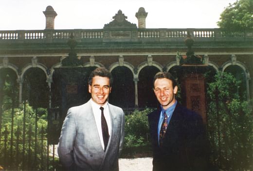
Launching in 1991 by Richard Jellis and Alastair Craig, the agency was inspired by luxury international brands of the time.
In the early 90s property marketing consisted of black and white sketches in the local papers, and in ’94, Jellis Craig was one of the first agencies in Melbourne to adopt photos on sign boards. The deep green and gold palette and column insignia was present through the brand’s formative years.
2014
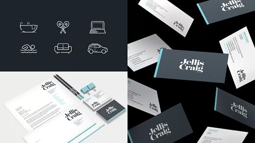
Not long after Jellis Craig transitioned to a franchise operation in 2011, the brand embarked on a significant visual identity update to unify our growing network and reflect the innovation at the heart of our business.
The 2014 brand evolution marked a bold step forward, introducing a dynamic visual identity that better aligned with our future ambitions and modernise the brand. A palette of carbon, teal, and white was paired with new stacked typography and clean lines, reinforcing our commitment to growth, cohesion, and premium service. This shift coincided with the expansion of our footprint across Melbourne’s premium inner suburbs and helped position Jellis Craig as a unified, forward-thinking property group.
2019
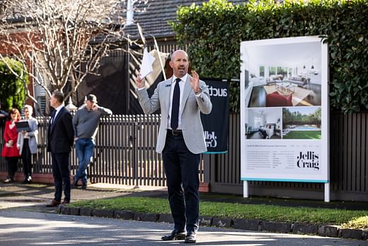
By 2019, Jellis Craig had entered a new era of strategic expansion, establishing a strong presence across Victoria’s premier lifestyle regions such as the Macedon Ranges, Ballarat and Daylesford.
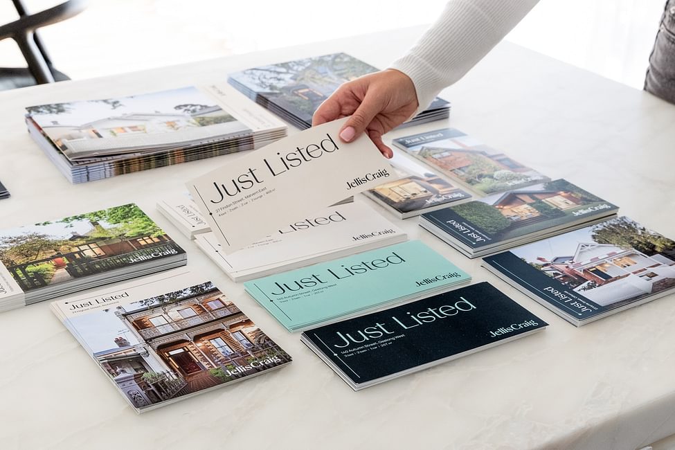
With a sharpened focus on the premium market, the brand’s visual language also evolved. Incorporating full-bleed imagery, elevated property presentation, and refined use of white space across its collateral to reflect the calibre of homes represented and to support our genuine connection with clients.
2025
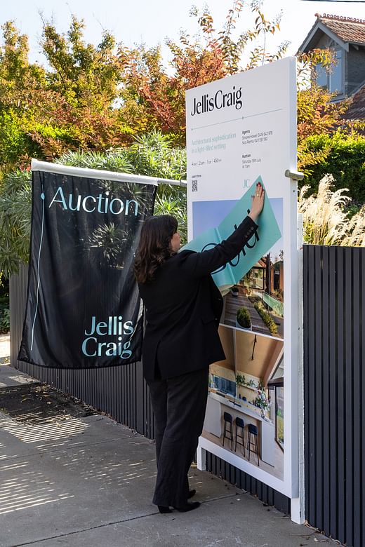
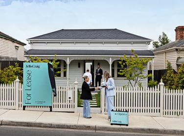
The Jellis Craig network has experienced significant growth since the 2021 market boom, welcoming new office locations across both peninsulas, and established hubs were strengthened through acquirements across the metropolitan area. Cementing our position as the most connected agency in Victoria, it was time to encapsulate our unique positioning in market.
After conducting customer research and discovery sessions with staff and clients, the Jellis Craig brand architecture was developed, and our Connected brand essence was realised. Beyond aesthetics, the new visual identity was grounded in our architecture and brand values. Design agency, Principals, was tasked with bringing our connected brand essence to life. Principals Director, Tim Riches, said: “The refreshed Jellis Craig brand needed to deliver aspirational sophistication and personal approachability. This was a nuanced task that required strategic design thinking and a solution with creative flexibility and balance.”
“This brand evolution reflects our commitment to stay ahead of that curve and to visually represent the calibre of our service and team. We knew our brand was strong, but like any great organisation, we took the opportunity to modernise. This new identity is about evolution, not revolution, it’s thoughtful and strategic.”
Andrew McCann, Jellis Craig Chief Executive Officer.
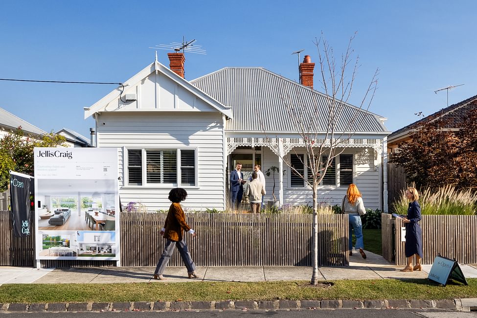
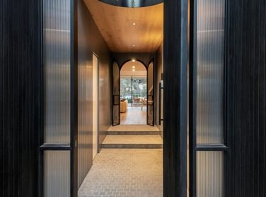
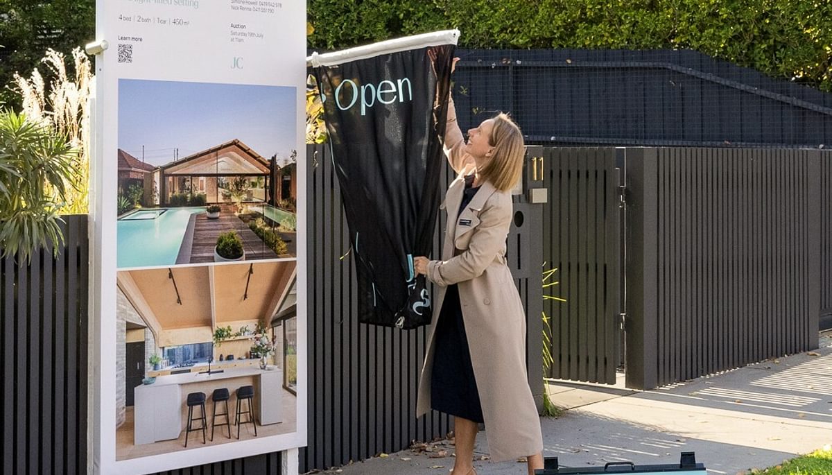
A modern, sophisticated palette of carbon, sage, linen, and white works alongside elegant typography and a distinctive graphic device. Together, these elements create a brand identity that feels fresh, refined, and premium, but also warm and approachable with nods to our past. Deeper than design, the brand refresh is guided by our purpose and vision: elevating the property experience and creating positive change in the communities we serve. At the heart of this is our new brand positioning — Your connection to something greater — a line that encapsulates the meaningful relationships, expertise, and opportunities we bring to every interaction.
“The new Jellis Craig brand is more than a logo, it’s a statement of who we are today and where we are headed,”
Nichola Emmins, Head of Marketing at Jellis Craig.
“The real estate marketplace has changed dramatically in recent years,” says Jellis Craig CEO, Andrew McCann. “This brand evolution reflects our commitment to stay ahead of that curve and to visually represent the calibre of our service and team. We knew our brand was strong, but like any great organisation, we took the opportunity to modernise. This new identity is about evolution, not revolution, it’s thoughtful and strategic.”
As we step into this next chapter, the refreshed Jellis Craig brand honours more than three decades of legacy while confidently embracing the future. It reflects who we are today and reinforces our commitment to excellence in every interaction. With a renewed visual identity and a clear purpose, we’re proud to lead the way in shaping the future of property across Victoria.
If you have any questions regarding the new Jellis Craig brand, please do not hesitate to contact one of our property specialists today.


